


This fabric comes in 40 colours
- Bright White 7801
- Wool White 7661
- Natural White 7803
- Cream 7860
- Sand 7885
- Light Yellow 7666
- Lemon 7735
- Neon Lemon 7823
- Maize 7971
- Gold 7725
- Neon Apricot 7937
- Orange 7778
- Neon Orange 7946
- Neon Red 7908
- Burgundy 7982
- Fire Red 7838
- Dark Red 7747
- Blush 7941
- Hot Pink 7787
- Neon Pink 7909
- Lilac 7834
- Violet 7922
- Baby Blue 7628
- Neon Blue 7828
- Sky Blue 7892
- Azure 7797
- Royal Blue 7843
- Navy 7976
- Midnight Blue 7844
- Neon Lime 7950
- Lime Green 7848
- Grass Green 7988
- Khaki 7795
- Fir Green 7704
- Caramel 7730
- Mocha 7957
- Silver 7811
- Nickel 7689
- Steel Grey 7741
- Black 7800
Gold here is a muted antique gold with a clear brown share. It does not glitter; the effect comes from the colour alone. On dark green or burgundy it reads autumnal and calm.
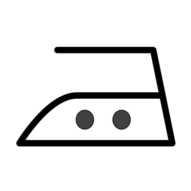
The thread takes washing at 60 degrees, and chlorine bleach in moderation as well. That suits it to laundry which has to run hot. Iron at medium temperature and rather from the back — pressed directly, the matt surface turns shiny in places.
On dark fabric a matt thread wants slightly more stitch density than a glossy one: it lacks the highlight that otherwise fakes coverage. A test run on scrap fabric settles this faster than any amount of thinking.
What Madeira Frosted Matt Gold is suitable for
- Machine embroidery on cotton, linen and sweat fabric
- Lettering, names and monograms
- Designs exposed to a lot of light
Sewing tips
- Maschinensticknadel der Stärke 75 oder 80 nehmen (Madeira empfiehlt Art. 9450).
- Die Oberfadenspannung etwas lockerer stellen als beim Nähen.
- Als Unterfaden ein dünnes Untergarn nehmen, nicht das Frosted Matt selbst.
- Matte Garne zeigen jeden Fadenzug — lieber langsamer sticken als zu schnell.
- Das Motiv nicht direkt bügeln; die matte Oberfläche wird sonst stellenweise glänzend.
- Die Farbnummer zum Projekt notieren, sie ist die Identität des Tons.
Available in more colours in the Madeira Frosted Matt series.
Frequently asked questions
How much thread do I need for one design?
That depends on stitch count and area. For lettering and small motifs one spool lasts a long time; for large, densely filled areas it pays to keep a second spool of the main tone in stock.
Does matt thread break more easily than glossy?
Not as a rule. It does show every pull of the yarn more clearly. Run the machine a little slower and loosen the upper tension a touch, and you get a calm surface without loops.
Can I mix matt and glossy thread in one design?
Yes, and the contrast is appealing: matt areas, glossy outlines. What matters is running both threads at the same stitch density, otherwise the matt part looks thinner than the glossy one.
What is the colour number for?
It is the identity of the tone. By eye alone you rarely hit the same shade again later, so the number belongs in your project notes — reorder by it and you get exactly the same tone.
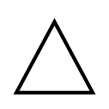
Care instructions:


Daten und Pflege
- Length (m)
- 500 m
- Colour code
- 7725
- Material
- 96 % Polyester, 4 % Keramik
- Artikelnummer
- 599028344